Dark Web Map: Introduction
Dark Web Map Series
I am publishing a new project called the the Dark Web Map. It is a visualization of ~6.6k web sites running on Tor’s onion services (née “hidden services”).
This post explains what the Dark Web Map is, what it means, and why I created it. If you already know what the term dark web means, then you may want to skip to the next section.
Defining the Dark Web
The term “dark web” is slowly entering the mainstream. It recently appeared on the cover of Time Magazine’s Cybersecurity special edition. These sorts of depictions are somewhat vague and ominous, usually including disembodied hands, a Guy Fawkes mask, and/or computer code floating in space. But what is the dark web, really?

Not to be confused with the deep web, the dark web comprises sites that can only be accessed by using special software. There are three major dark web technologies in existence: Tor, I2P, and Freenet. Of the three, Tor is by far the most popular and most active. For the purposes of this Dark Web Map, I am focusing exclusively on Tor.
Tor is a privacy-preserving technology with two distinct purposes. The first purpose is to hide the locations of users who are browsing the web. Every time you connect to a website, that website sees your IP address. That address can be traced back to your internet service provider (ISP), and the ISP can match that address to your account. Tor, on the other hand, encrypts your browsing traffic and mixes it with other users' traffic using a technique called onion routing that hides your IP address from the websites that you visit. It also hides the traffic from your ISP, who can see when you’re connected to the Tor network but cannot determine what sites you are accessing through it.
The second purpose of Tor is to hide the location of the website itself. When you visit a website, your computer first determines what the IP address is for that website. That IP address can be traced back to a business or individual in just the same way that your own IP address can be traced back to you. Tor allows a website to hide its IP address from its users. Such sites are called “onion services”. (In the past, these were also called “hidden services”, but the Tor Project has shied away from this term due to the negative connotations.)
It is this second feature, the anonymous onion services, that form the dark web. Onion services can actually do a lot more than just web sites: they support file sharing, chat programs, video streaming, etc. For this reason, it is more accurately called a dark net or overlay network, but the Dark Web Map covers the web sites only.
Anonymity technology such as Tor is undeniably dual-use. A democratic activist can evade the surveillance machine of an oppressive government, a news organization can offer enhanced protection for whistle blowers, and the average citizen can browse the web without being tracked by marketers and microtargeted by advertisers. On the other hand, several dark web drug markets sell deadly fentanyl, and child pornographers brazenly exchange illegal pictures and videos.
Visualizing the Dark Web
The Dark Web Map is a visualization of 6,608 sites that were present on the dark web during a January 2018 crawl. This is not an exhaustive listing of all onion services, because many onion services are not easy to discover by crawling. Also, you may recall from the previous section that not all onion services are websites. According to the Tor Project’s statistics, there are over 60,000 onion services running at the time of publication, so this sample represents about 10%.
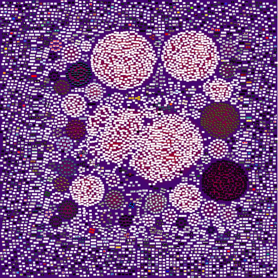
The dark web map is a huge image (~2.7 billion pixels) that visualizes these dark web sites. You can move around the map and zoom into see features of interest. The graphic above shows the map zoomed all the way out. At this level, each site looks like a little dot. However, if you zoom in to the top left corner, you can start to see additional details.
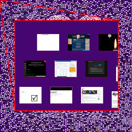
At this zoom level, you can start to see a screenshot from each dark web site, but let’s zoom in a little further.
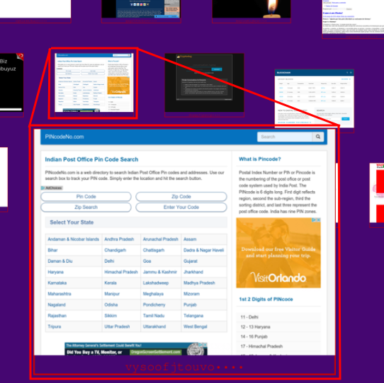
At this zoom level, you can see a dark web site clearly enough to read it! This site has something to do with the Indian Post Office and zip codes. Despite being “dark web”, it looks like a pretty normal web site. An onion address is displayed under each site. This particular onion site is called “vysoofjtouvo••••”. The last four letters are masked off because the Dark Web Map is meant as a visualization and research project, not as a dark web directory. The motivation for this decision will become clear if you explore the Dark Web Map yourself for a bit—there is a lot of heinous content.
A line connects two sites if those two sites are similar. (A future blog post will explain the similarity calculation and other technical details.) Here is an example of two sites that are similar, but not identical:

These are both gambling websites. Although the names and color schemes are different, there are structural similarities. Both sites have a masthead across the top, a menu on the left side, a news column on the right side, and a content area in the middle. If you look very closely in the upper right corner, you will even see the same social media icons (Facebook, Twitter, and Google) on each site.
When a large group of sites are all similar to each other, they form a cluster on the map. Here is an example of several clusters. The cluster circled in red contains 38 web sites.
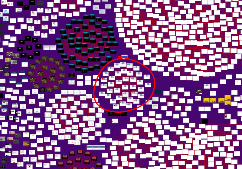
If you zoom in, you can see what these sites are, and also understand why they are clustered together.
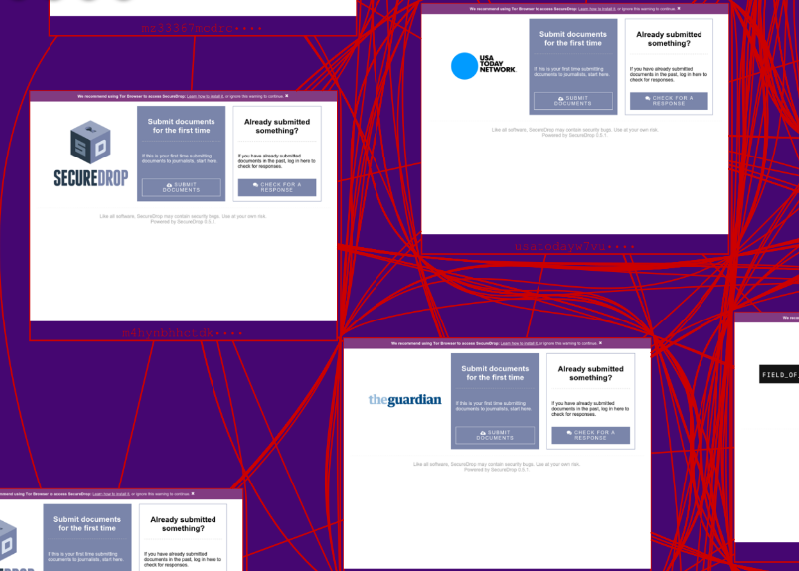
This cluster contains various web sites running Secure Drop, which is an anonymous whistle blowing system. You can see that several large organizations maintain a dark web presence with Secure Drop software, including USA Today and The Guardian.
Take another look at the zoomed out map overview that you saw above:
At this zoom level, you can see quite a few large clusters and very many small clusters. This visualization conveys a sense of what’s out there on the dark web and provides a sense of proportionality, e.g. how many dark web sites are dedicated to whistle blowing vs. selling drugs?
If you want to see for yourself, you can explore the Dark Web Map. (Note: my former company is no longer hosting the Dark Web Map, and this link does not work.)
You may notice several large clusters in the middle of mostly blank web pages. Many of
these pages have one or two lines of text like 404 Not Found or 504 Gateway Time-out. What are these doing in the dark web map? The map include all of the pages
that I could successfully download. Without getting too technical here, the pages that
appear to display an error in the Dark Web Map sent HTTP codes that indicated success,
e.g. 200 OK. This contradiction between what the web server says and what the web page
says is still a bit of a mystery to us, but weI have some theories that I will explore
in some upcoming blog posts.
What’s Next?
The purpose of building the Dark Web Map is to shine a light onto a buzzwordy and frequently misunderstood technology. This is an educational resource and an exploratory dataset for neophytes and experts alike.
In future posts, I will discuss the technical decisions and details involved in creating the map and offer a more rigorous analysis of the data it contains. Until then, I encourage you to explore it on your own (but heed the disclaimer!) and share your findings with us or ask questions.