Dark Web Map: How It's Made
Dark Web Map Series
If you like How It’s Made, that weird and wonderful documentary series that reveals the manufacturing processes for goods ranging from rubber bands to medieval axes, then you will love this installment in my Dark Web Map series. This post describes how the map was created and explains some of the key design decisions. I am about to get technical and nerdy in here. If that’s not your bag, then look out for the next post in the series where I will explore the content of the map in greater detail.
Overview
I build the Dark Web Map in three distinct phases:
- Screenshots
- Layout
- Rasterization
Each step is described in detail below. The entire process is carried out using some Python scripts that I created just for this purpose, as well as some standalone tools like Splash, Graphviz, and Inkscape.
I have included rough estimates of time and resource usage, where appropriate, to give you a sense of how computationally intensive the process is. Most of the work is done on a midrange desktop computer, but one step is done on a high-end Amazon EC2 instance.
Screenshots
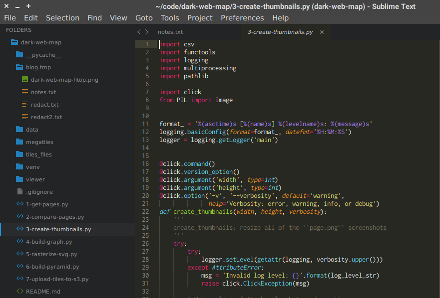
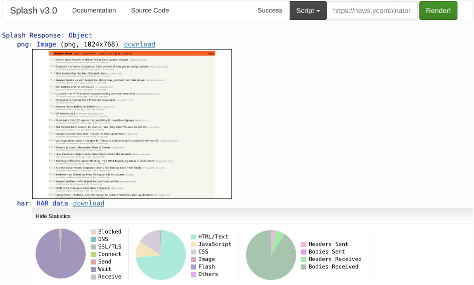
The map is comprised of thousands of thumbnails of onion site home pages. Obviously, creating these thumbnails is a crucial part of building the map. I began with a seed list containing 59k onion sites and then rendered each site using Splash, which is a headless browser with a REST API created by my friends over at ScrapingHub. Splash downloads and renders a web page just like a real browser. It can return the HTML from the page and also a PNG screenshot of the viewport.
Crawling thousands of Tor sites is an inherently slow process. The Tor network introduces significant latency because of the extra hops required to relay traffic and the strained resources of volunteer relays. Many onion sites are resource constrained themselves, running on inexpensive shared hosting. Many onion sites are short-lived, i.e. they are pulled offline before I have a chance to contact them. And many onion sites are not even running a web server at all!
As I contact each site, I wait up to 90 seconds for a response. If an onion does not respond to my request, then the site is either offline or is not running a web server on a common port. (There is no easy way for us to distinguish these two cases.)
To speed up the process of crawling these sites, I run a cluster of Splash instances that allows us to make parallel requests to many different onions at once. This Splash cluster project is open source. It was developed as joint project between Hyperion Gray and ScrapingHub on the DARPA Memex project.
It takes about 48 hours to process a seed list of 59k onions. During my January 2018 crawl, only 6.6k onions responded. That is cumulatively 1,310 hours (52,400 timeouts * 90 seconds per timeout) spent waiting for timeouts, which shows why parallelism is necessary. For this project, I made up to 90 concurrent requests at a time against my Splash cluster.
Finally, the screenshots are resized from Splash’s default resolution (1024×768 px²) down to a more workable resolution of 512×384 px2 . This step is distributed over 8 logical cores and only takes a few minutes.
Layout
Next I need to compute the layout, i.e. where each screenshot will sit on the Dark Web Map. The Dark Web Map is organized by putting sites that are structually similar close together and drawing lines between them, so the first step is to measure similarity for all these pages.
There are a lot of different ways I could define structural similarity. For my purposes here, I chose a very simple approach called Page Compare that I first experimented on the DARPA Memex program. Page Compare was originally developed as part of a smart crawling experiment, where it was used to group similar pages together so that a crawler can intelligently infer the dynamic template used to render those pages.
Page Compare uses HTML features to compute a similarity metric between two web pages. As an example, consider a simple HTML file. This file describes a document tree:

Page Compare flattens the document tree using a depth-first traversal. For example, it
would transform the document above into a vector like html, head, title, body, h1, a.
In simpler terms, it produces a list of the tags in the order that they appear in the
document. It repeats this process for a second page. Then it computes an edit distance
over the two vectors, i.e. the number of changes required to make one vector equal to
the other, similar to Levenshtein
distance. This edit distance is
normalized by the lengths of the vectors to produce a metric between 0.0 and 1.0.
If this description sounds complicated, the actual implementation is pretty short: under
20 lines of Python code. Unfortunately, short code does not mean efficient code.
Comparing all of the web pages is, in fact, a very slow process because all pairs of
pages need to be computed. For example, if there are 10 pages, then you need to compare
45 pairs (10 * 9 / 2). For all you stat majors out there, this is the same as C(n, 2),
the combination of n items taken 2 at a time. The number of comparisons grows very
quickly as n increases. For the 6.6k onions in my sample, I need to perform 22
million comparisons!
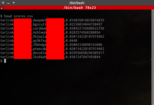
Distributing my (admittedly unoptimized) script over 8 logical cores, this step takes 15 hours to complete. When it finishes, I have a list of 22 million scores, one score for each pair of pages.
Next, I convert these raw scores into dot format, which is a language for describing a
graph (in the mathematical sense of the
word). In this step, we select a threshold for page similarity. A pair of pages over the
threshold is connected with a line in the final map and placed close to each other. A
pair of pages under the threshold is not connected with a line and may be placed far
apart. Therefore, the threshold value strongly affects the layout and aesthetics of the
final map.
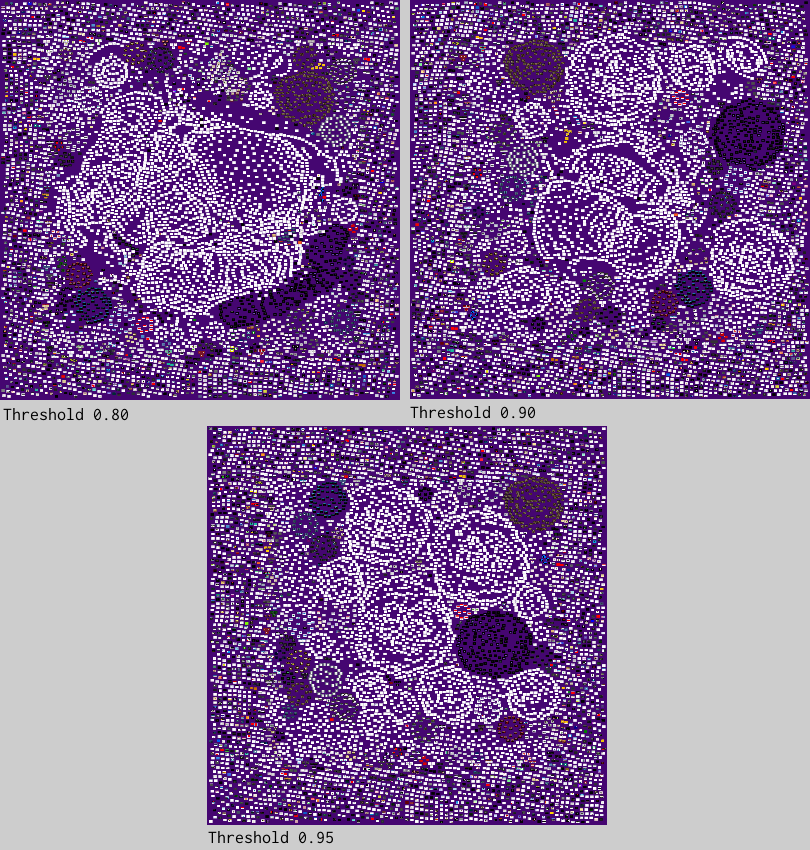
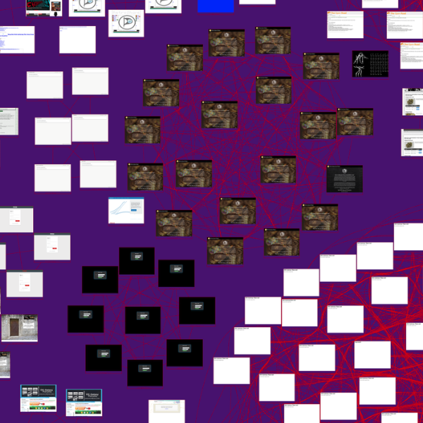
This graphic shows three different renderings with varying thresholds. At 0.80, one third of the onions merge together into one huge blob in the middle of the map. When the threshold increases to 0.90, more distinct clusters begin to take shape. At 0.95, the clusters become very isolated and almost perfectly circular. Somewhat arbitrarily, I select the 0.90 threshold as the best tradeoff between cluster size, shape, and aesthetics.
I use Graphviz to compute a layout for the dot file. Graphviz takes all of the
screenshots I have and tries to position onions that are similar close together and
moves dissimilar onions further away. The layout technique is called a “spring layout”
because it simulates the physical properties of springs, as if tiny virtual springs
connected each pair of sites. The result is that large groups of similar onions form
into circular clusters.
The layout step only takes a few minutes, except for one important caveat: the lines that connect similar onions are likely to overlap the screenshots. Graphviz can intelligently route the lines around screenshots by drawing them as curved splines instead of straight lines, but routing the splines takes about 3 hours! Therefore, most of the testing is conducted with splines disabled, and then splines are turned on to produce the final rendering.
GraphViz positions the onions in a 2D space, but it is not able to rasterize the map, i.e. convert the map into a bitmap graphic. Because the map is so big, GraphViz will slowly eat up all free memory, run for about 10 minutes, and then produce a blank PNG file. As a workaround, I can ask GraphViz to produce an SVG file (which is not a raster format) and worry about rasterization later. This step produces a ~180MB SVG file.
Rasterization
The final goal of the Dark Web Map is to create a very high resolution graphic that users can pan and zoom through. The map contains about 3 billion pixels, which requires more memory than the the average computer has. So I broke the image up into a bunch of smaller images, called tiles, each of which is no larger than 256×256 px². I use a special image viewer to dynamically figure out which tiles need to be displayed at any given time as the user moves around the map. This drastically reduces the amount of memory required to display the map and enables it to be viewed by ordinary users with commodity hardware—even a smartphone! This structure is called an image pyramid.

As mentioned above, GraphViz chokes when rasterizing such a large image, and it’s not
alone. Other programs such as vips dzsave and Inkscape specialize in rasterizing SVG
files, but these both fail to handle an SVG file as large as ours. Fortunately, Inkscape
has a workaround: it can export a subregion of an SVG. Since my ultimate goal is to
produce small tiles, this is a promising approach, but there is a major drawback. Due to
the size of the SVG file, Inkscape needs about 15GB of memory and 3 minutes of compute
time per tile. If you have less than 15GB of free memory and the kernel starts swapping,
then the runtime increases to about 15 minutes.
If each tile is 256×256 px², then I need to rasterize 44k individual tiles. At 3 minutes per tile, it would take 92 days to rasterize all those tiles! (Note that runtime is dominated by the size of the SVG file that Inkscape reads in, not the size of the PNG that it writes out.) I can render tiles in parallel, but since each tile also needs 15GB of memory, even a high-end desktop computer can only render about 4 tiles at a time.
As a compromise, I decided to rasterize large tiles—I call them megatiles—that are 4096×4096 px². At this size, each megatile is just small enough that Inkscape can successfully process it, but big enough that it drastically cuts down the number of tiles I need to render. I only need 196 megatiles to rasterize the entire map, and at 3 minutes per tile, that is 9.8 hours of compute time.
Since I am impatient, and also want to have a bit of nerdy fun, I can kick it up a notch
by throwing some hardware at the problem. Amazon Web Services has a monster EC2 instance
called r4.16xlarge that has 64 logical cores and 488GB of memory. I cannot utilize all
64 cores due to the memory intensity of rasterization, but I can run 32 rasterization
processes in parallel without swapping to disk.
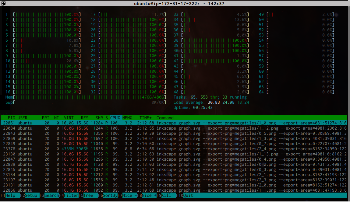
This cuts the rasterization time down to about 20 minutes, plus a few extra minutes to copy data to and from the EC2 instance. This on-demand instance type costs $4.25/hr, so this is a great tradeoff.
After rasterization, I use another bespoke Python script to break each megatile down into 256 individual tiles at 256×256 px² each. This script creates the final image pyramid by recursively grouping adjacent tiles and downsampling until I are left with a top-level image that is just 1×1 px². This process takes about 10 minutes. In total, the map consists of over 55k tiles in 17 layers and is 1.2GB on disk.
Finally, I upload the image pyramid and embed an OpenSeadragon viewer into the website to allow users to interact with it. That’s it!
Discussion
In addition to the technical side of building the Dark Web Map, the human side is also crucial. I went through several drafts of the map and had hours of conversations with coworkers. We discussed what our goals are with this project, the extent to which we should redact material, and whether we should even publish the map at all. As we converged on a final draft, I reached out to acquaintances at tech companies and law enforcement agencies to get their opinions on these questions as well. I arrived at several conclusions.
The first conclusion is that I want to present this as an objective visualization that users can explore and draw their own conclusions from. I have an obligation (both legal and ethical) to redact certain types of content, but a great deal of objectionable content is intentionally left unredacted.
Second, I want to aid understanding and debate about the dark web, but I do not want to function as an onion directory, especially for sites that are illegal. There are plenty of other resources out there to find content on the dark web.
Third, I want to use the map as a jumping off point for a more detailed, public analysis of the dark web. Future articles in this series will explore the content of the map in greater depth and provide interpretations and extra data for the reader’s benefit.
These sorts of questions never have perfect answers, and there will always be plenty of criticism (especially from strangers on the internet). I believe it is important to communicate my values and the care that has gone into delivering this project to the public. I welcome feedback on this project at every level, from the technical nitty gritty to the broad social implications.